
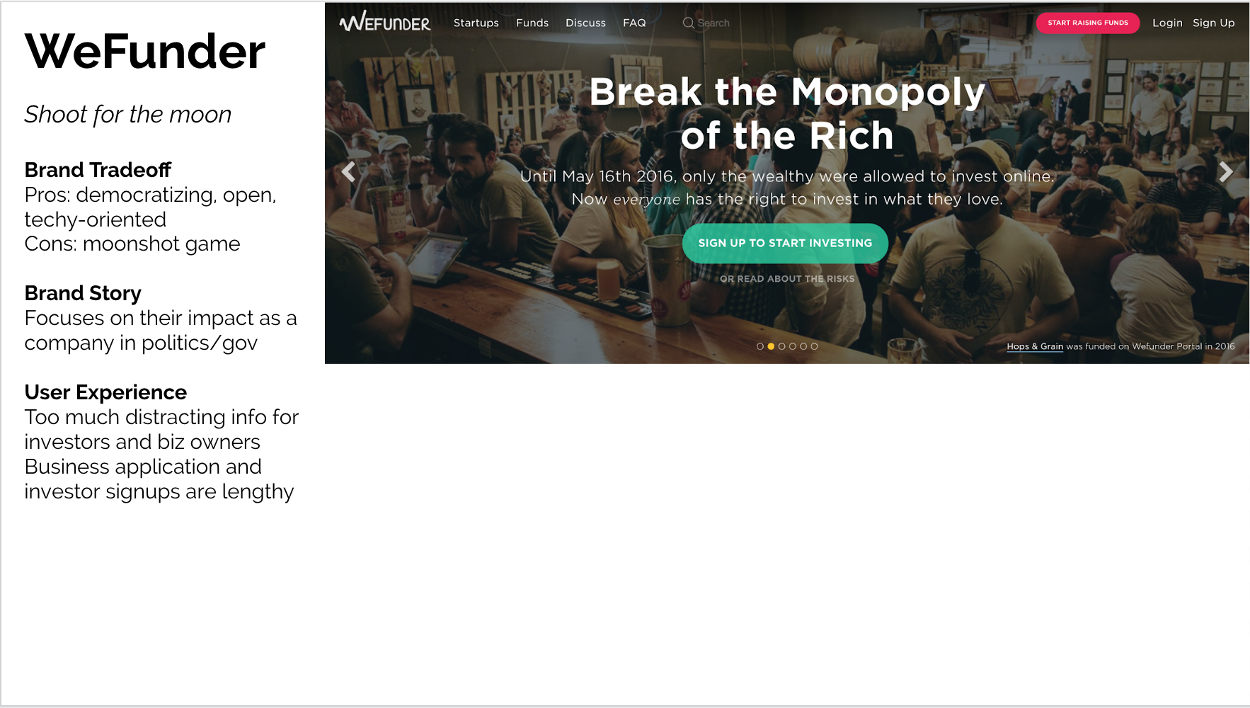
Honeycomb Credit is a crowdfunding platform that allows every day people to invest in small businesses in their community.
When I joined the team in August 2018 as the first marketer and employee #3, one of my biggest priorities was to define the brand of the emerging company and translate that into a vibrant, inviting website experience. It goes without saying that a company’s website is essential to doing business in the digital age, and in particular, the homepage is the defining location of direct traffic from potential investors and small business owners to beginning their Honeycomb experience.
Problem
Let’s take a quick peek at what the homepage looked like before my time at Honeycomb:
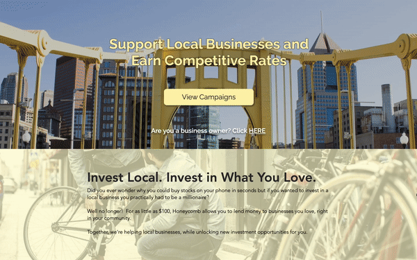
old design
original homepage before my redesigns
While the homepage included robust information about how to invest and why to invest, there were some main challenges to the delivery:
Customer messaging and value propositions were unclear
Highly academic approach towards explaining investments
Tagline “Support local businesses and earn competitive rates“ didn’t click with customers
Different website sections addressed the two separate sides of the market (investors / business owners) without a cohesive message
Unintuitive, uninviting user experience
Big call-to-action buttons like “Like us on Facebook“ distracted from the key CTA to explore investment campaigns, which is the most high-value way to direct people to make an investment
Opportunity for a more cohesive visual brand to bring to life the vision of building vibrant communities
The faded brown and light yellow colors seemed outdated
The generic use of stock photo images did not promote a hospitable air
Research
After identifying the main challenges of the user experience and user interface of the homepage, I conducted detailed research in website best practices and delved into an audit of our competitors’ websites. I developed a scoring sheet that evaluated the overall brand appeal, visual elements, homepage layouts, and website messaging for each site. Using these newfound insights, I built the core strategy around defining Honeycomb’s homepage experience.
Goals
The main goals that I wanted to achieve with the new homepage experience were:
Introduce Honeycomb’s value propositions for investors
Investors outweigh small businesses in traffic to homepage, so the top priority was to drive investments, while striving to make the whole page inviting to both sides of the market
Build trust in the brand and legitimacy of Honeycomb
Ensure a brand voice that is is approachable, trustworthy, and disruptive
Bright visuals of real small business owners in their storefronts
Replace faded colors with bright splashes of yellow
Improve website readability
Increase white space-to-content ratio
Streamline layout & take out redundant language
Make text more readable
Emphasize visual hierarchy
Centralize call-to-actions strategically
Focus on one single call-to-action repeated throughout the page: to go check out the live investment campaigns
Remove unnecessary CTAs to unrelated pages like liking us on Facebook
Design + Implementation
I designed a lo-fi wireframe on paper and built out a hi-fi prototype on Canva, before getting feedback from my team. Once finalized, I built the page on Wix and followed up with customer interviews and analytics tracking to test the effectiveness and messaging of the page. The following is the newly designed homepage, which was live from 2018-2020.

homepage redesign 1
2018-2020
Follow-ups
After redesigning the homepage, my next efforts concentrated on expanding the full information architecture of the Honeycomb website. Alongside the homepage, the main navigation centered on “Live Campaigns,” which directed users to explore investment opportunities on the platform; “Business Owners“, which is the converting page for our small business lead generation funnel; “Investors”, which educates potential investors on the values of investing locally and how to do so; “About Us,” our company’s team page; and “Resources“, our informational hub for small business content.
My follow-up projects centered on redesigning the website experience of all of those key pages.
Impact
Since 2018, the homepage has received 210K+ page views and the whole website has surpassed 1M page views.
As the Honeycomb brand evolved and matured, I spearheaded follow-up projects to update the key website pages to align with the overall brand strategy. The following shows the most recent version of the homepage, circa 2022:

homepage redesign 2
2020-present
